Classification
Website, Data Visualization
Typefaces
JAF Facit, Artill Weather Icons
Production
jQuery, Sweat, Stretching, Rudimentary Cartography
Size
Responsive
Website, Data Visualization
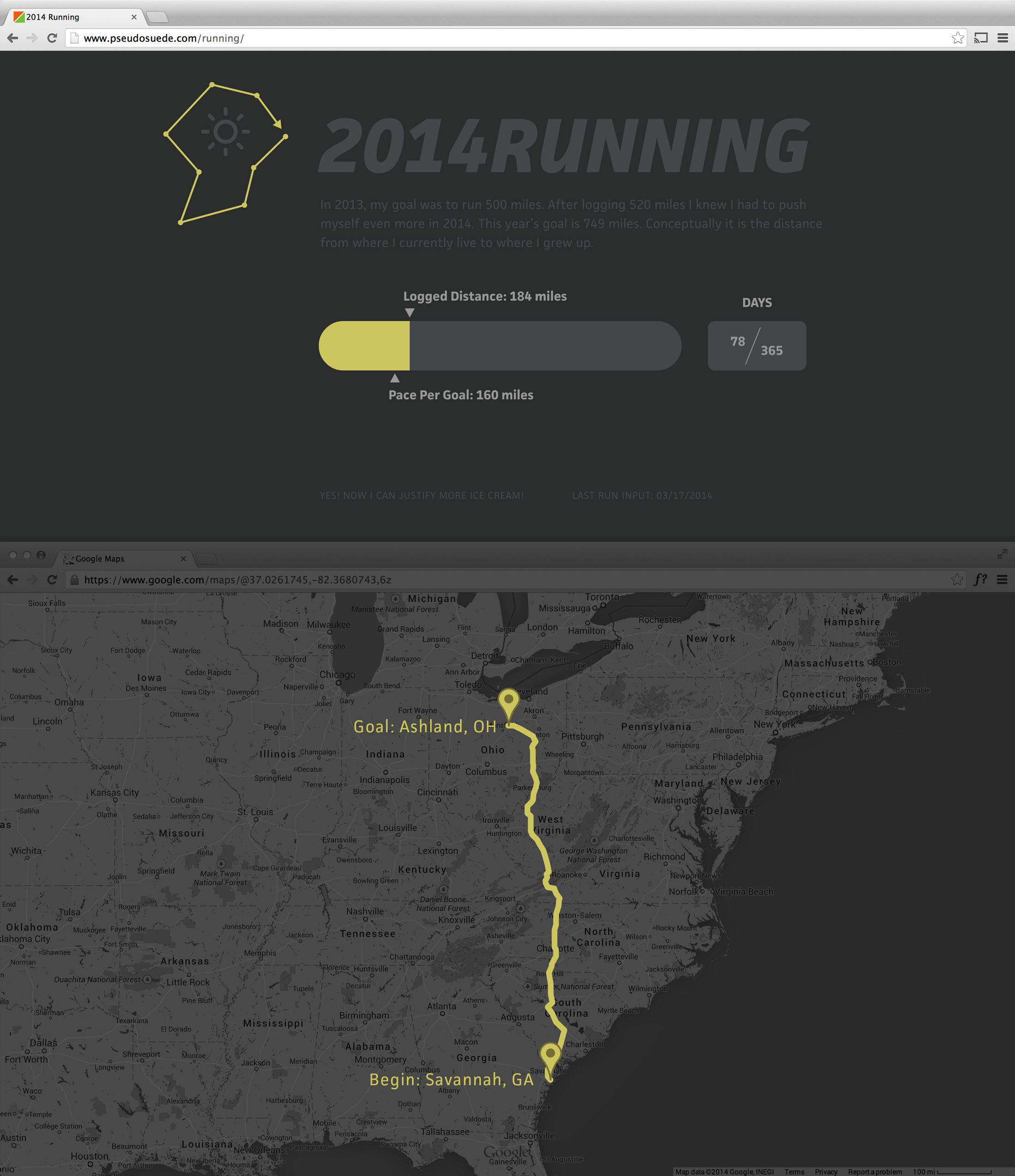
The project logo suggests the exploratory nature of my runs. Most of the data you see on the website was dynamically populated using JavaScript.

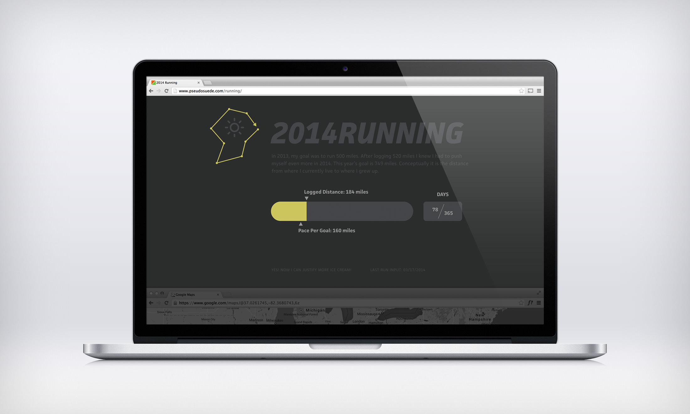
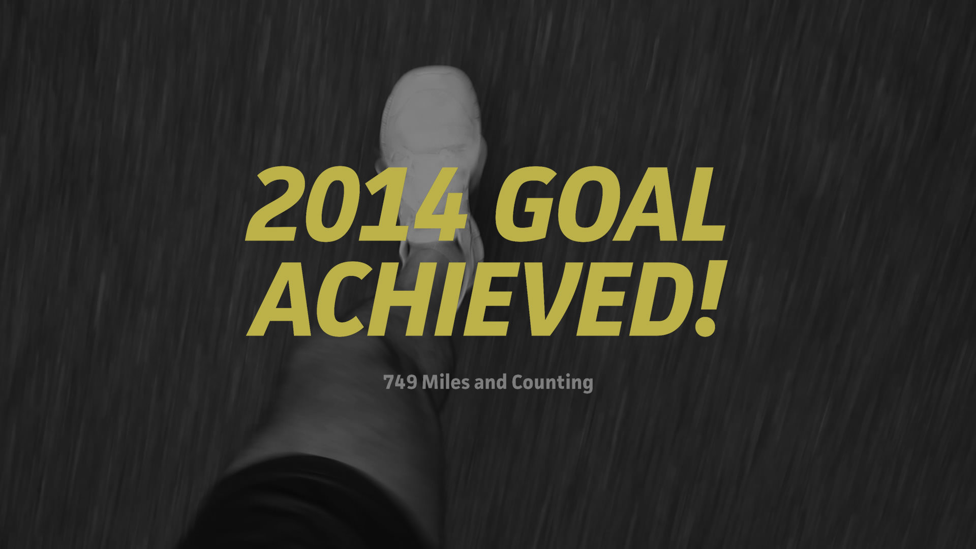
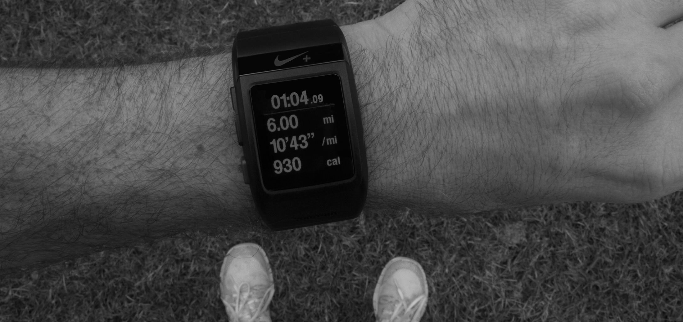
I really enjoy running. I never used to enjoy running until I discovered that I could capture and organize data with fancy watches (also, I like food, so the calorie offset doesn’t hurt). I like running because I like being outside. It’s a good place to think. In 2013 my goal was to run 500 miles. After logging 520 miles, I wanted to push myself even more in 2014. I set that goal at 749 miles. Conceptually it is the distance from where I currently live to where I grew up. To keep track of my goal in 2013 I made a basic text website to help keep track of whether I was on pace or needed to catch up. Since I already had the basic JavaScript solved, I decided to create a more visually engaging version so others could follow along.
Classification
Website, Data Visualization
Typefaces
JAF Facit, Artill Weather Icons
Production
jQuery, Sweat, Stretching, Rudimentary Cartography
Size
Responsive
Only two items were manually added. They were the Logged Distance Value and the Last Input Date. Most of the data elements on the website were generated via JavaScript and/or jQuery scripts. The most important external resource I used was the Countdown for jQuery plugin by Keith Wood. I used it to determine how many days had passed in the current year. Without it, the majority of the scripts I wrote would be useless. With that value I was able to figure out the pace based on my goal, the placement of the arrows, and the width of the yellow region. The returned value in miles was converted to a percentage so that the information could be presented accurately within a flexible width container. Based on the relationship of the Logged Distance Value and the Pace Per Goal Value, I programmed some text to let me know if an ice cream reward is in order. Obviously.
Since I checked the website before every run to verify the distance I needed to maintain my pace goal, I incorporated the Simple Weather plugin by James Fleeting to give me an idea of the forecast in Savannah, Georgia (I don’t run on vacation). The plugin pulls data from the Yahoo! Weather API and the resulting info is presented via a weather icon font.